Doctor MI
Doctor MI is a German luxury medical skincare brand started by dermatologist and retinol expert Dr. Miriam Rehbein.
Website
doctormi.com
Status
Completed 2025
Services:
- Website Design
- Website Development (custom Shopify Plus)
- Information Architecture
- UX / UI Design
- Creative / Photography Direction
- Digital Brand Presentations
Before
When Doctor MI approached us to redesign their Shopify website, they were already a successful medical skincare brand with a proprietary retinol encapsulation technology and a prominent dermatologist founder in Dr. Miriam Rehbein who also runs a fully-booked dermatology clinic in the heart of Munich. The future for brand is to move into the luxury segment with further plans to refresh the brand identity and packaging.
The challenge
Our challenge was to reimage the e-commerce CX towards luxury, and to reorganize the information architecture focusing on product collections and ingredient technology.
The existing website, while on Shopify Plus, was not utilizing the full power of the platform. It was riddled with unnecessary apps, the UI was clunky, difficult to navigate with mismatched typography and colour combinations. Overall, the UX was simply confusing and the products lacked the descriptive information needed for a high-tech medical skincare brand.
CONCEPTING
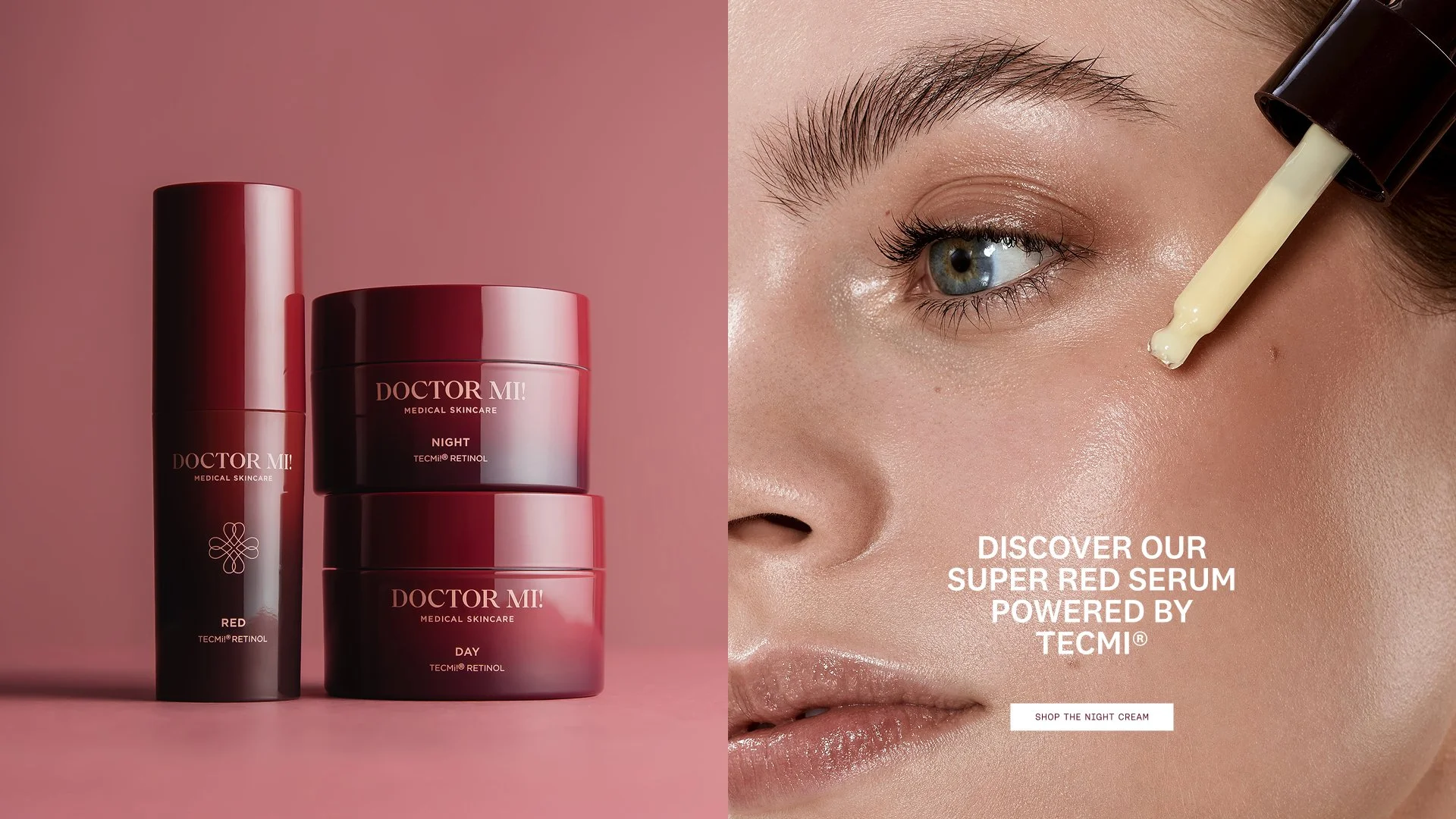
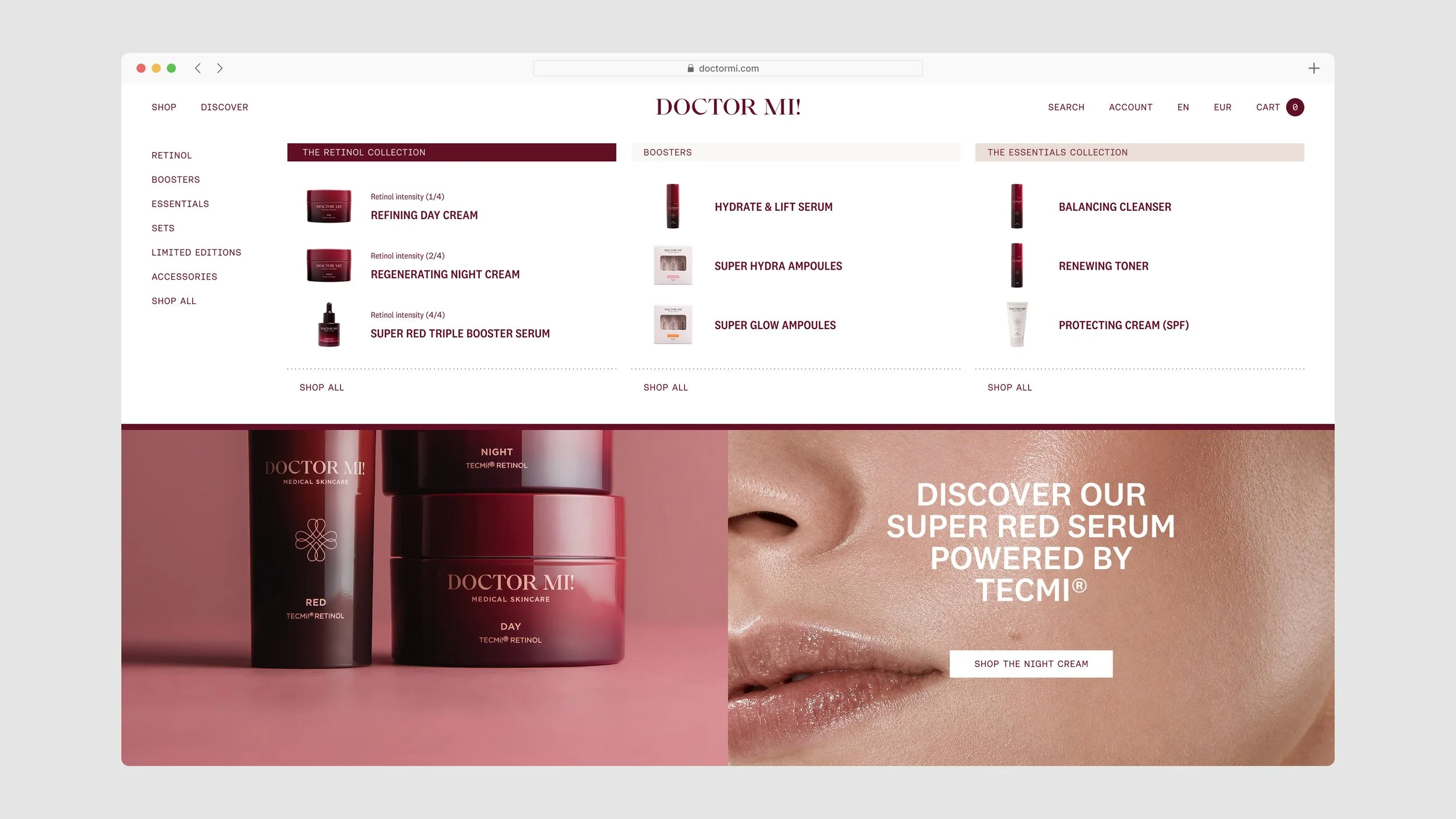
The brand team knew they wanted to differentiate the product collections by colour and associate the brand’s iconic burgundy colour with retinol. They further wanted to showcase the product benefits and ingredient science in detail and indicate the retinol intensity of the products containing retinol.
The Solution
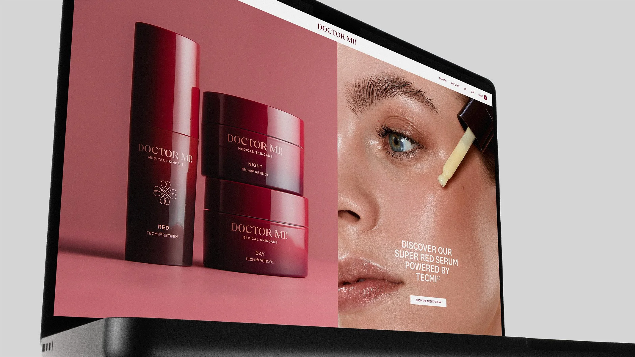
We assisted in defining the collection colours and locking down the perfect burgundy shade for digital. We updated the typography with a sophisticated yet approachable typeface that works well in print and digital.
We completely reimagined the UI with distinct hero sections and micro animations, with a custom Retinol intensity rollover on product cards with retinol inside. The PDP was overhauled and indicates the product collection with its corresponding colour before moving into naming, product USP above the variant and subscription selection and moving down into custom sections showcasing the ingredient science in extensive detail. We added a soft dotted background to all science sections to differentiate scientific content from brand content. All elements are responsive and elegantly rearrange to ensure a consistent mobile experience.


Navigation
Product discovery and speedy access to bestsellers was a top priority. We reused the existing transparent PNGs in the mega menu to display the top 3 selling products of each collection. For retinol products, we made sure to display the retinol intensity throughout all navigation screens including cart and search, for quick info display and user convenience. We pulled out the collections differentiated by colour in the all products page, so the viewer can quickly filter by collection with one click, or filter with more specific combinations using the filter + drawer slideout.
We developed a very convenient functionality for subscription products in the cart, to allow the user to quickly toggle between subscription frequency and one-time purchases right within the cart. This saves the user an additional click back to the PDP if they need to adjust the subscription option and further upsells the saving with the subscription option.


Product Photography
We worked closely with the brand internal team to achieve a unified photography style with differentiated background colours to denote the different collections. Retinol being the hero collection, naturally adopted the brand burgundy colour.
We developed a detailed product photography direction guide defining every detail from the angles, lighting and shadow treatment to the background colours, what paper to use for the infinity curve, how to group and stack product sets, and how to treat textures and smears.


